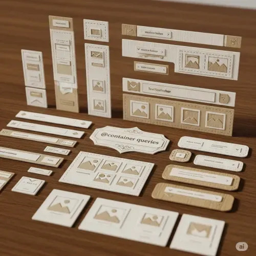
Understanding Container Queries in Web Development
Container queries are a Baseline 2023 feature, now available in all major browsers including Chrome, Edge, Firefox, and Safari.
This feature is marked as [newly available].
What Are Container Queries?
The @container rule allows us to create truly responsive components. Unlike traditional @media queries, which respond to the viewport size, container queries let components adapt based on the size of their parent container. This means a component can look great no matter where it is placed, as long as it is properly configured.
Container Types
To use container queries, you must define a container. There are three main types:
- Size containers: Respond to the container’s width, height, or both.
- Inline-size containers: Respond to the container’s inline (usually horizontal) size. This is the most common and widely supported.
- Style containers: Respond to computed style values (less common, but useful for advanced scenarios).
You define a container using the container-type or shorthand container property:
/* Shorthand: name/type */
.component-wrapper {
  container: hero/inline-size;
}

/* Or just type */
.component-wrapper {
  container-type: inline-size;
}
Container Names
Naming your container allows you to target it specifically in your queries:
.container {
  container-name: sidebar;
  container-type: inline-size;
}
Or with shorthand:
.container {
  container: sidebar/inline-size;
}
Container Query Syntax
Container queries are similar to media queries, but they target the container instead of the viewport.
@container (min-width: 400px) {
  .card {
    flex-direction: row;
  }
}
If you use a named container:
@container sidebar (min-width: 400px) {
  .sidebar-content {
    display: flex;
  }
}
You can use logical operators like and, or, and not:
@container (min-width: 400px) and (max-width: 800px) {
  /* styles */
}
Supported Container Features
You can query the following container features:
width,min-width,max-widthheight,min-height,max-heightinline-size,min-inline-size,max-inline-sizeblock-size,min-block-size,max-block-sizeaspect-ratio,orientation
Example:
@container (min-inline-size: 600px) {
  .gallery {
    grid-template-columns: repeat(3, 1fr);
  }
}
Container Units
Container queries introduce new units relative to the container:
cqw,cqh,cqi,cqb,cqmin,cqmax
For example:
.card {
  width: 80cqw; /* 80% of the container's width */
  height: 50cqh; /* 50% of the container's height */
}
Nesting and Agnostic Queries
You can nest container queries and use them without specifying a name, making them more generic. This is useful for reusable components.
@container (min-width: 500px) {
  .profile {
    flex-direction: row;
  }
}
Practical Example
Suppose you have a hero component that should change layout based on its container size:
.hero-wrapper {
  container: hero/inline-size;
}

@container hero (min-width: 48ch) {
  .hero__buttons {
    flex-direction: row;
    justify-content: flex-start;
  }
}
If you move .hero-wrapper into a smaller parent, the layout will automatically adapt.
Why Use Container Queries?
With container queries, the size of the parent container determines how the component is styled. This is a big shift from media queries, which only consider the viewport. For example, if you place your hero component inside an aside, it will render differently than if it is in a full-width parent. This flexibility allows for more modular and reusable components.
In summary:
Container queries enable components to be truly responsive to their context, not just the viewport. By defining containers and using @container rules, you can create flexible, adaptive layouts that work anywhere in your design. The spec supports named and unnamed containers, multiple container types, logical operators, and new container units, making it a powerful tool for modern CSS architecture.
P.D.
You can also use range syntax in container queries, just like with @media:
@media (50em > width > 30em) {
  /* … */
}
And in a container query, it looks like this:
@container (50em > width > 30em) {
  /* … */
}
This follows the same rules as previous definitions.


Comments for CQX001