Using CSS Global Properties: A Practical Guide
In my latest project, I explored some exciting CSS features that simplify web development and enhance the user experience. These tools are perfect for creating modern, dynamic websites with surprisingly little code.
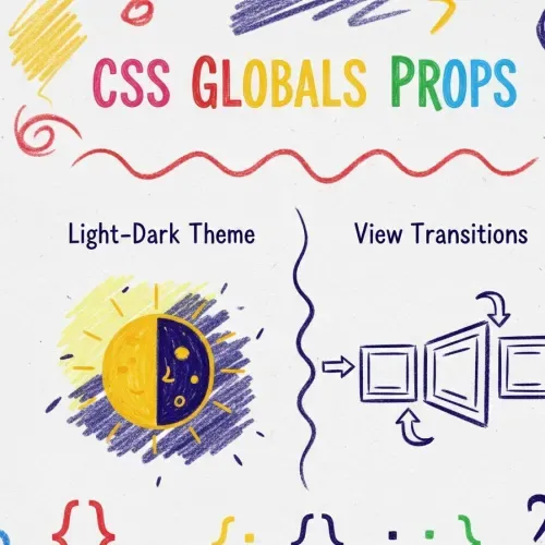
In this notebook post, I’ll share my experience with new CSS global properties that are particularly useful for implementing light-dark theme support directly in CSS and creating smooth view transitions between pages. Let’s dive in!
Light-Dark Theme Support with color-scheme
Say goodbye to complex JavaScript for theme switching! With the color-scheme property, you can enable light and dark modes effortlessly. Respecting a user’s operating system preference for a light or dark theme is a significant win for both accessibility and user experience.
To enable this feature, start by using the color-scheme property at the root level of your CSS. This property tells the browser that your site supports light mode, dark mode, or both.
Here is the primary implementation:
:root {
    color-scheme: light dark;
}
If you only want to support a single mode initially, you can specify that as well:
:root{
    color-scheme: only light; /* or only dark */
}
Once color-scheme is set, you can use the light-dark() function to dynamically style elements based on the active theme. This allows you to define styles for both themes at once.
The syntax is straightforward: light-dark(<light_mode_value>, <dark_mode_value>);
.element {
    background-color: light-dark(white, #333);
    color: light-dark(black, lime);
}
In this example, when light mode is active, the .element will have a white background and black text. In dark mode, it will automatically switch to a dark gray background with lime text.
Seamless Page Navigation with View Transitions
Another powerful feature for creating a polished user experience is the View Transitions API. It allows you to create animated transitions between different page states, making your website feel as smooth and responsive as a native application.
In the new css specifications we can take adventage of this only with css @view transitions
To enable a simple, cross-page fade animation, add the following to your global CSS:
    @view-transition {
		navigation: auto;
	}
With this single rule, navigating between pages will no longer be an jarring jump but a soft fade.
For more advanced effects, you can customize the animation using pseudo-classes like css ::view-transition-old(root) (the page you are leaving) and css ::view-transition-new(root) (the page you are entering).
What’s truly impressive is how it handles individual elements. If an element, like an image or a heading, exists on both the old and new pages, you can make it appear to seamlessly move from one position to another. Simply assign the same unique view-transition-name to the element on both pages.
For example, imagine a user clicks a product thumbnail in a gallery. To have that thumbnail smoothly expand into the main product image on the product detail page, you would do this:
Gallery Page HTML:
<img src="product.jpg" style="view-transition-name: product-image;" />Product Detail Page HTML:
<img src="product.jpg" style="view-transition-name: product-image;" />The browser will see the matching view-transition-name and automatically create a fluid “morphing” animation between the two states. You can learn more about the underlying pseudo-elements like ::view-transition-group on MDN .
Modern CSS offers powerful tools to build sophisticated, user-friendly websites with less complexity than ever before. By leveraging the color-scheme property and the View Transitions API, you can implement automatic theme switching and fluid page animations that will delight your users.
I highly encourage you to experiment with these properties in your own projects. They are simple to implement and offer a massive return in user experience. Happy coding!

Comments for NCSSPG